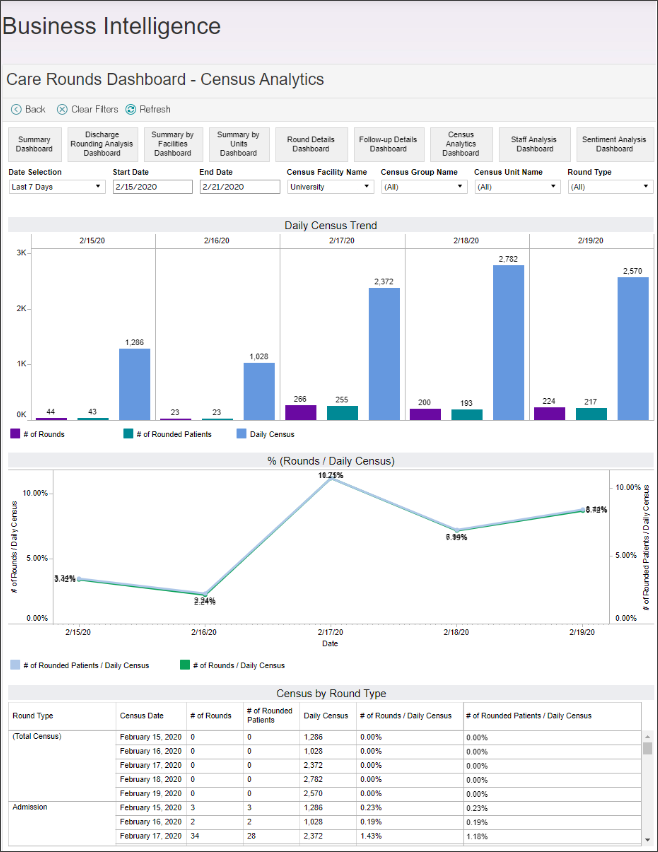
The Census Analytics Dashboard displays more specific trending data about the rounds made in relation to the census. The displayed data includes the census and number of rounds by given day trend, number of rounds by census trend, and the details for census by round type.
The Daily Census Trend graph shows an overall trending visualization of the rounding completed for the census in the given timeframe. The purple, teal, and blue colors represent the percentage distribution of rounds to census in the data provided to VCE on a given date.
The # of Rounds by Daily Census graph displays the percentage of rounded patients in the census on a given date in a blue line, and the percentage of rounds completed in the census on the given date in a teal line on this graph.
The Census by Round Type graph displays the details of the calcuated percentages for the completed rounds by round type and date.