[Data Source: Vocera Messaging Platform, Voice Server] Displays usage of simultaneous logins, Vocera Genie sessions, and Vocera Messaging Platform logins compared to the current license limit. Display depends on the selected license type filter. Use this dashboard to review overall license numbers and the potential need for additional licenses.
The information displayed on the screen is determined based on the filters that you apply. The available filters are:
| Filter Name | Filter Description |
|---|---|
| Date Range | The date range to include in the results. By default, the value is the current date; however, you can select from a list of options. For example, you can select the option "Last 7 days" or "Last 30 days." |
| Facilities | Used to filter data based on user facilities (common facility name) specified while mapping Vocera Voice Server User Site and Engage Facility. |
| License Type | Used to filter license data based on the license type. The options
are:
|
| Timeline | Used to filter license data based on the timeline type. The options
are:
|
Use the Reset button to default the facility filter to All. However this action will also reset other filters to default values.
- Genie
- Messaging
- Voice Login
The widgets and its corresponding data are displayed based on the type of license selected.
Genie
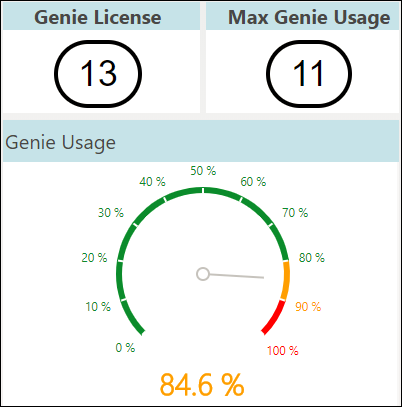
- Genie License Details
- Genie License—Specifies the total genie licenses assigned to the user.
- Max Genie Usage— Displays the maximum number of concurrent genie usage within the selected filter.
- Genie Usage Percentage—Displays the percentage of maximum genie usage within the selected filter.
- Genie Trend
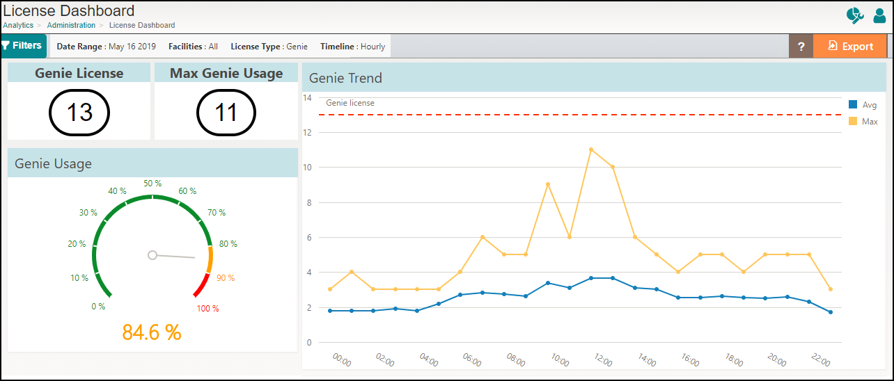
Genie License Details
It is a combination of widgets that summarizes the total genie license, maximum usage of the genie, and percentage of usage. The indication of genie usage is color-coded in green, yellow, and red. For genie usage within 80%, the value is displayed in green. For usage of genie anywhere between 81% to 90%, the value is displayed in yellow. If the genie usage is 91% and beyond, the value is displayed in red to indicate that the user is approaching the maximum number of licenses assigned to their organization. This information helps the user to take precautionary measures or procure additional licenses.
For example, in this scenario,
- Genie license configured for the user = 13
- Maximum genie used = 11
- Percentage of maximum genie usage = 11/13 x100 = 84.6%
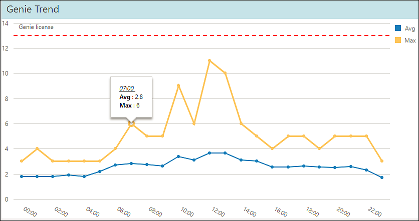
Genie Trend
This widget displays genie license usage trend per hour over a 24-hour period or adaptive time range based on the timeline filter selected. By default, the hourly timeline filter is selected. Mouse over a trended value to display the time of the day and its corresponding average genie usage count and the maximum genie usage count during the selected time. Click on a legend to toggle the view.
The formula to calculate average genie usage for adaptive timeline: (Genie usage on day 1 + Genie usage on day 2) / Number of days
For example, consider this scenario:
- Date range filter selected: 2 days
- Genie usage at 16:00 hours on day 1 = 10
- Genie usage at 16:00 hours on day 2 = 20
- Maximum genie usage at 16:00 hours for 2 days = 20
- Average genie usage at 16:00 hours for 2 days = (10+20) / 2 = 15
Messaging
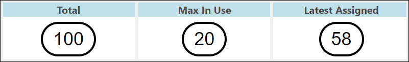
- Messaging License Details
- Total—Displays the latest number of licenses for the
selected date range.Note: When you configure VMP source for the first time, Total widget displays the value only when users with module type Messaging or Contacts are assigned to the license.
- Max In Use—Shows the maximum number of concurrent users that are logged in to the Vocera Collaboration Suite for the selected date range within a facility.
- Latest Assigned—Displays the latest number of licenses assigned for the selected facility and selected date range.
Note: VMP license upgrade takes 24 hours to display the updated VMP license data on the dashboard. - Total—Displays the latest number of licenses for the
selected date range.
- User Details
- Message Usage Trend
Messaging License Details
It is a combination of widgets that summarizes the total number of messaging license, maximum logins in use, and latest assigned for the selected facility.
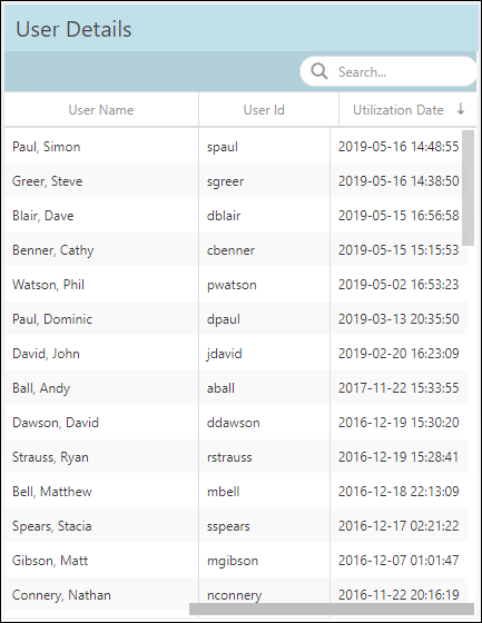
User Details
This widget displays details of users that are assigned licenses within a facility. Details such as username, user id, and utilization date are displayed. By default, the information is sorted based on the latest utilization date.
To find a specific username or user id, use the Search field.
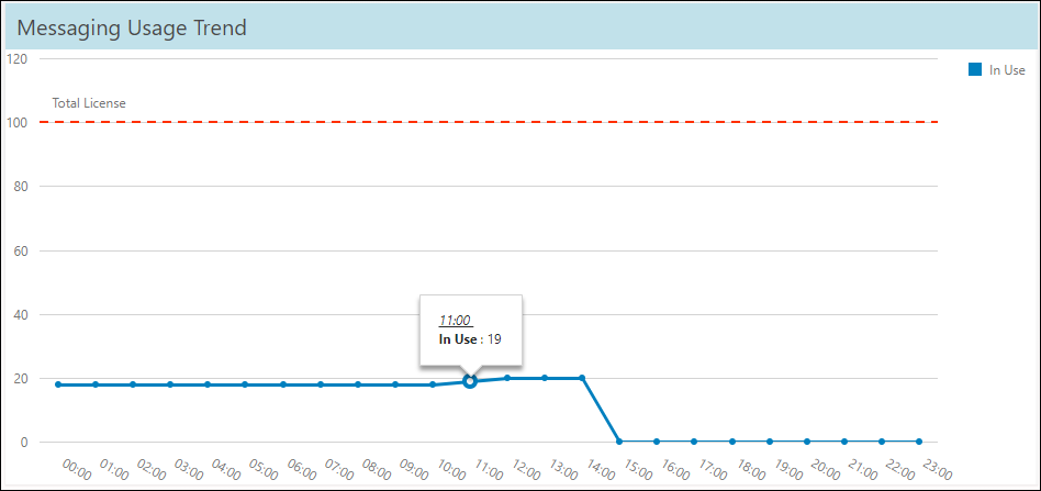
Messaging Usage Trend
This widget displays simultaneous user login trend per hour over a 24-hour period or adaptive time range based on the timeline filter selected. By default, the hourly timeline filter is selected. Mouse over a trended value to display the time of the day and the corresponding licenses in use during the selected time. Click on a legend to toggle the view.
Voice Login
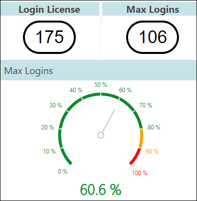
- Login License Details
- Login License—Specifies the total login licenses.
- Max Logins—Displays the maximum number of concurrent users that are logged in within the selected filter.
- Max Logins Percentage—Displays the percentage of maximum logins within the selected filter.
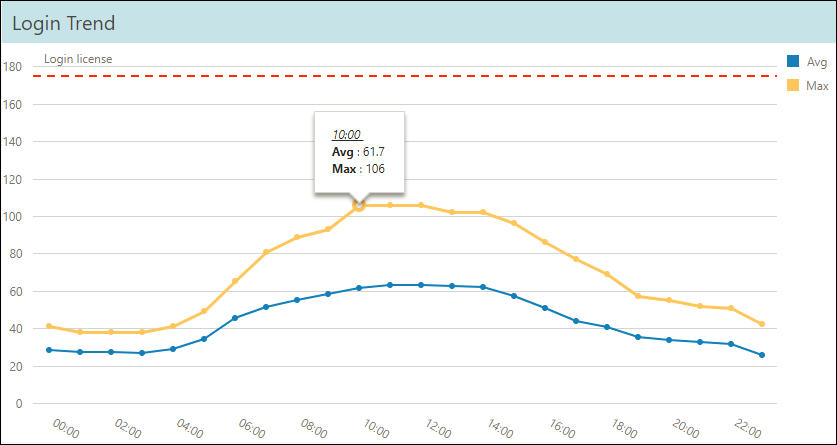
- Login Trend
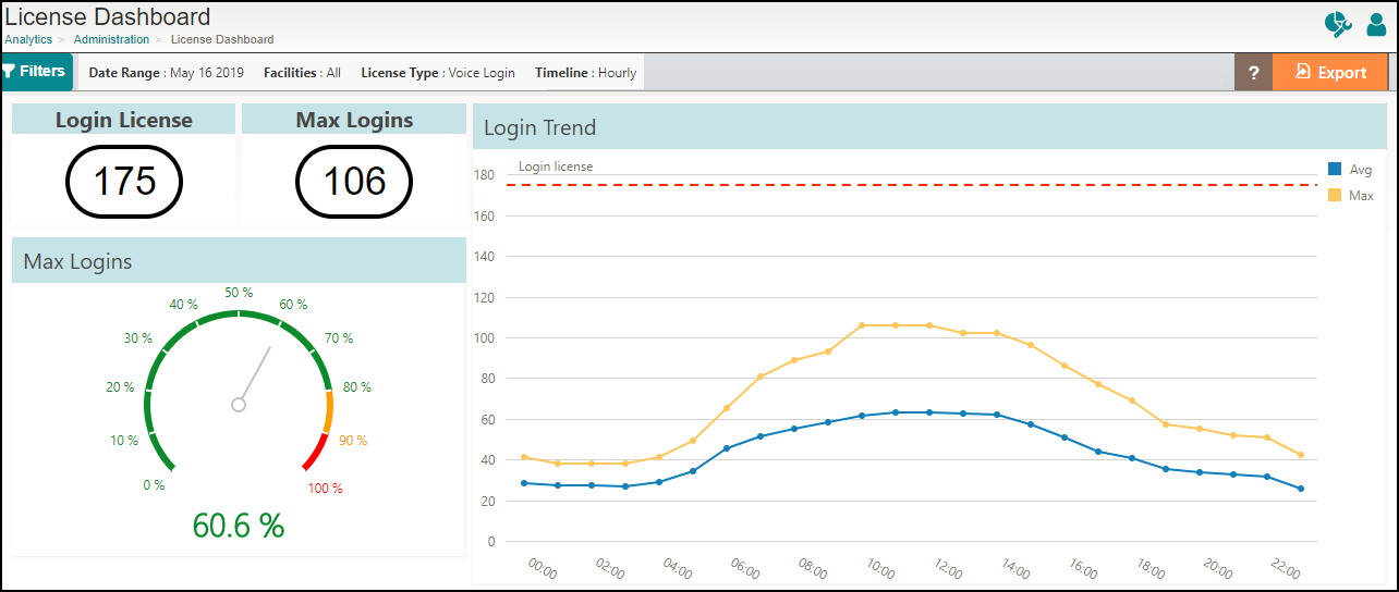
Login License Details
It is a combination of widgets that summarizes the total login license for the facility, maximum logins, and percentage of maximum logins. The login license data is fetched directly from the License Info page of Vocera Voice Server. The indication of maximum login is color coded in green, yellow, and red. For logins within 80%, the value is displayed in green. For usage of login anywhere between 81% to 90%, the value is displayed in yellow. If the maximum logins is 91% and beyond, the value is displayed in red to indicate that the user is approaching the maximum number of logins assigned to their organization. This information helps the user to take precautionary measures or procure additional licenses.
For example, in this scenario,
- Login license configured for the user = 175
- Maximum logins used = 106
- Percentage of maximum logins = 106/175 x100 = 60.6%
Login Trend
This widget displays simultaneous user login trend per hour over a 24-hour period or adaptive time range based on the timeline filter selected. By default, the hourly timeline filter is selected. Mouse over a trended value to display the time of the day and its corresponding average logins and the maximum logins during the selected time. Click on a legend to toggle the view.
The formula to calculate average login count: (Login usage on day 1 + Login usage on day 2) / Number of days.
For example, consider this scenario:
- Date range filter selected: 2 days
- Logins at 12:00 hours on day 1 = 100
- Logins at 12:00 hours on day 2 = 150
- Maximum logins at 12:00 hours for 2 days = 150
- Average logins at 12:00 hours for 2 days = (100+150) / 2 = 125