[Data Source: Engage] Provides a summary of users responses to interruption events. Data includes total events, responses and saves as well as trended data over time. This dashboard is used to review the progress of platform usage and workflow validation using a percentage of acceptance or saved events over time.
The information displayed on the screen is determined based on the filters that you apply. The available filters are:
| Filter Name | Filter Description |
|---|---|
| Date Range | The date range to include in the results. By default, the value is the current date; however, you can select from a list of options. For example, you can select the option "Last 7 days" or "Last 30 days." |
| Facilities | Used to filter data based on user facilities (common facility name) specified while mapping Vocera Voice Server User Site and Engage Facility. |
| Units | Used to filter data based on user
units (common unit name). Common unit names are referenced from a
crosswalk table cwunit that are mapped from Vocera Voice Server User Department and Engage Units. Note:
The displayed units drop-down filter may be constrained due to the Facilities filter. Unknown Unit or Department display data for all users that are not part of any department selected within the Facilities filter. |
This dashboard has the following widgets:
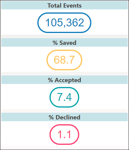
- Total Events
- % Saved
- % Accepted
- % Declined
- Event Trend
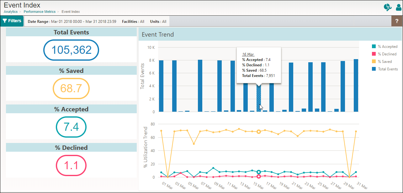
Following is a sample Event Index dashboard:
Events Widget
- Total Events: Displays the total number of events based on the unique event ID generated by the Engage system. The data displayed includes both delivered and undelivered events.
- % Saved: Lists the percentage of events that were saved but not
delivered because of the set rules. The calculation is based on the formula: (Total Undelivered
Events / Total Events) * 100
For example, consider Total Events is 25, Undelivered Events is 4, then % saved = (4/25) * 100 = 16%
- % Accepted: Displays the percentage of delivered events that were
accepted. The calculation is based on the formula: (Accepted Events / (Total Events –
Undelivered Events)) * 100
For example, consider Accepted Events is 18, Total Events is 25, and Undelivered Events is 4, then % Accepted is (18 / 21) * 100 = 85.71%
- % Declined: Displays the percentage of delivered events that were
declined by the Engage system. The calculation is based on the formula: (Total Declined Events
/ (Total Events – Undelivered Events)) * 100
For example, consider Total Event is 25, Declined Events is 12, and Undelivered Events is 4)) , then % Declined = (12/21) * 100 = 57%
Note: An event is counted only once even if multiple decline responses exist for a single event.
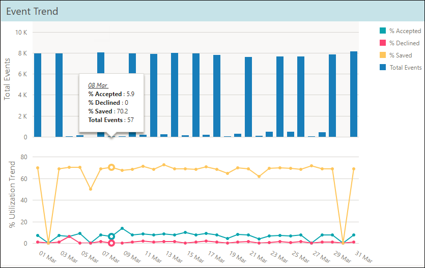
Event Trend
The Event Trend widget represents the total events in a bar graph and the utilization percentage in a trended graph. The graph indicates the total number of events that were delivered and undelivered for the selected date range. Mouse over a bar in the bar graph or a particular trend graph to display the percentages of accepted events, declined events, saved events, and the total events for the particular time frame.
For example, in the following figure, the count for 8 March displays % Accepted as 5.9, % Declined as 0, % Saved as 70.2, and Total Events as 57.